
Role: Lead Designer + Communication Coordinator, UX/UI Designer
Tools: Squarespace
Timeline: 2 weeks | Project at Redemption North Mountain
Tools: Squarespace
Timeline: 2 weeks | Project at Redemption North Mountain
Overview
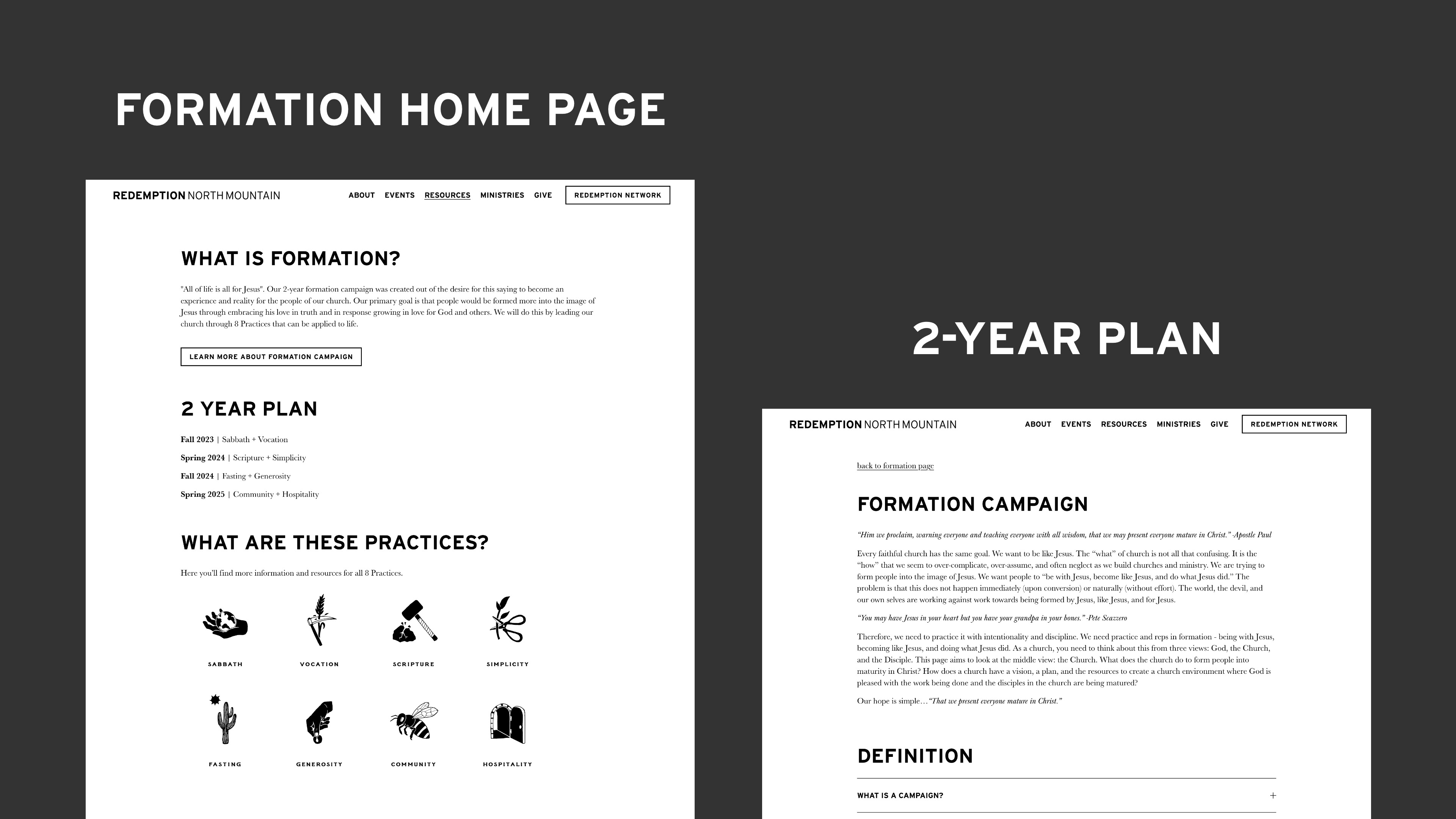
This project involved a complete redesign of the Formation section of Redemption North Mountain’s website. The goal was to improve access to spiritual formation resources by making the content easier to find, scan, and digest. The previous pages were visually confusing, text-heavy, and buried key information behind unclear PDF links. My redesign focused on clear hierarchy, cleaner layout, and better information architecture to serve a wide variety of users. View live webpage.
Goals
- Help users quickly understand the 2-year formation campaign
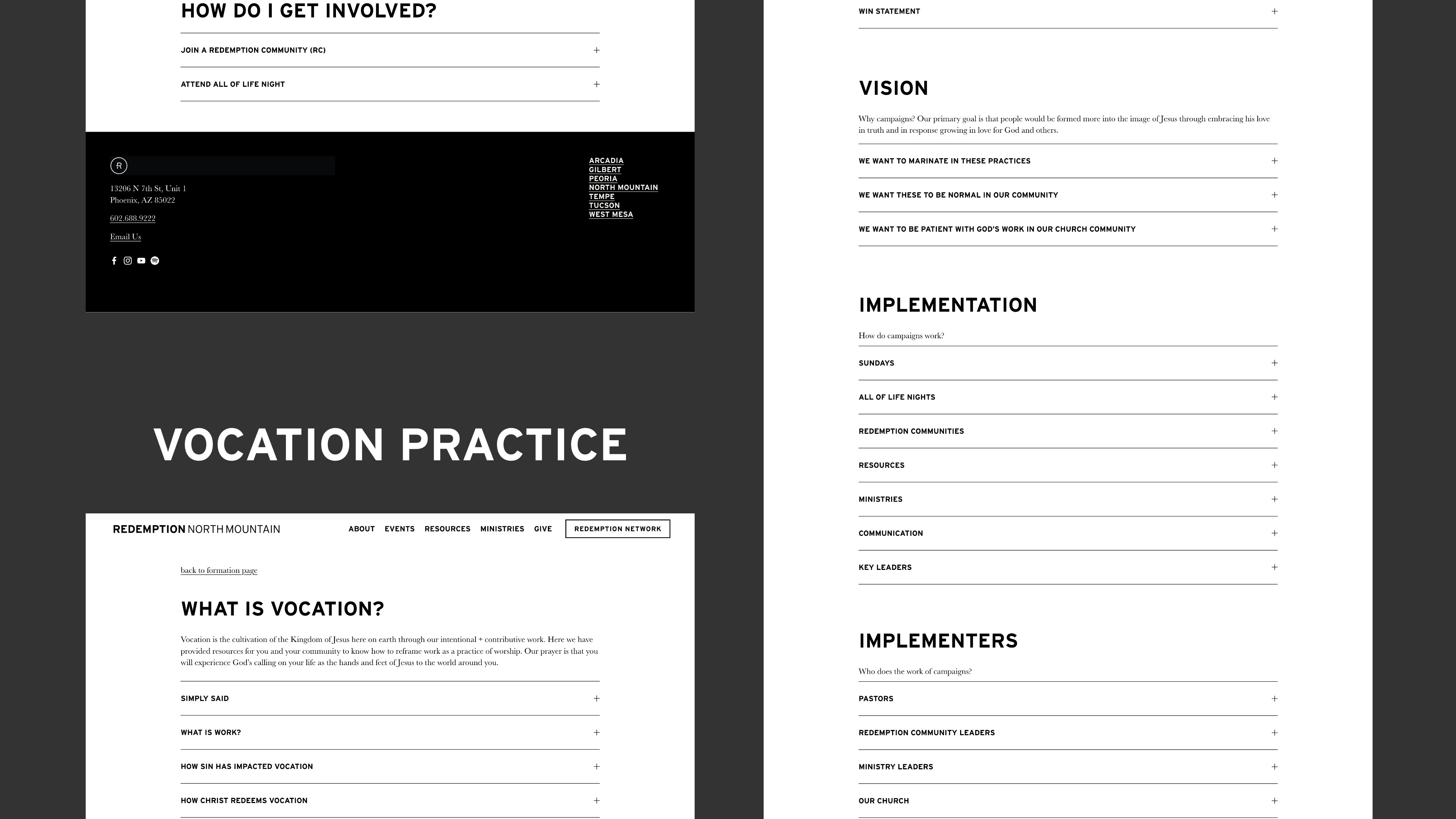
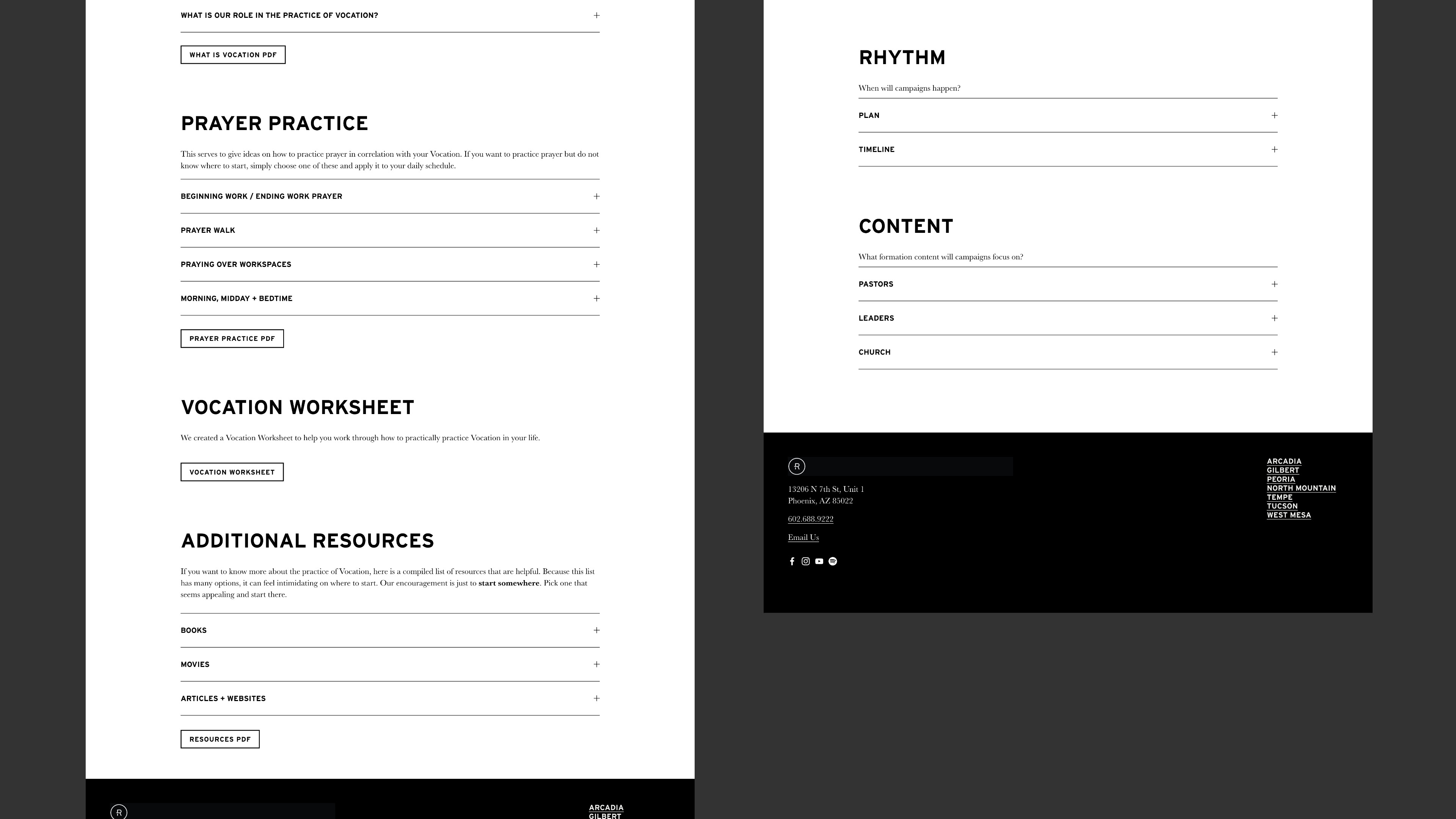
- Make each of the 8 practice pages easy to browse, read, and revisit
- Eliminate confusion around downloads and links
- Create a mobile-friendly experience with collapsible sections
My Role
I led the redesign of the Formation overview, 2-Year Formation Plan, and individual Practice pages:
- Reorganized copy for clarity and scannability
- Used Squarespace’s accordion tools to break content into digestible sections
- Created clear visual hierarchy using headings and spacing
- Designed CTA-style links for PDF viewing with clear labeling
Key Problems I Solved
Before:
- Practice pages were cluttered with oversized vector images and random links
- Users had to open multiple unlabeled PDFs to access content
- Clickable images on the Formation homepage had no indication they were interactive
After:
- Each Practice page now presents all core content directly on the page
- Content is divided into labeled accordions for easier scanning and access
- PDF links are still included but clearly marked as such
- Formation homepage features clean, clickable navigation tiles for each practice
Webpage Screenshots

Implementation Highlights
- Used Squarespace’s accordion tools to create structured, collapsible content blocks
- Improved semantic labeling (headings, link names) for accessibility
- Built with mobile and desktop in mind to ensure users could access content from any device
Impact
The redesigned Formation section is now a useful, navigable resource for people at every stage of spiritual growth. By removing barriers and improving information design, the site better serves its purpose: helping people grow in love for Jesus and others through the church's formation plan.
What I Learned
- How to think like a content strategist — not just a visual designer
- The importance of information hierarchy and progressive disclosure in UX
- How to redesign for accessibility, clarity, and user trust
- How even small improvements (like clearly labeling a PDF) can make a huge difference